FASHION Black Jacket Suiting
Ryan at Black Jacket Suiting was wonderful to work with and is extremely passionate about the quality of his product and service. He needed a website which reflects the same high quality.
The website has many customisations which you won't find on many other suit websites. Some include very intuitive quote and reservation forms, one of the sexiest online shopping cart we've ever built, measurement wizards and more.
You won't find any two pages the same on this website. Every page is custom designed to work in with the overall goals. Since it's launch it has had a great conversion rate and everyone loves it.
FACT ONE It takes about 0.05 seconds for users to form an opinion about your website that determines whether they like your site or not, whether they’ll stay or leave.

ACCOUNTING / TAX / WEALTH Advice Co.
We began armed with a marketing brief from a 3rd party, and set out to develop a new logo, style guide, business cards, letterheads, pull up banners, office signage, email signatures - and finally, a brand new website.
The team at Advice Co are now confidently updating and changing content and creating new pages when they have new campaigns and projects which require a web page.
This was a thoroughly enjoyable project from start to finish and I'm really proud of the final result.
FACT TWO 57% of internet users say they won’t recommend a business with a poorly designed website on mobile

WEBSITE PLATFORM / MULTISITE Stacked Site
Stacked Site is a WordPress Multisite with a large number of websites currently hosted on the platform.
This project is by far the largest project I've ever worked on with continuous development taking place now for 5 years. There is also no sign of slowing and there are more designers now building on the platform than ever before.
The success of this project has lead to other multisite environments and particularly website solutions which support franchises.
FACT THREE 38% of people will stop engaging with a website if the content or layout are unattractive

FINNANCIAL / SUPER FUNDS Intrust Super
Intrust Super are one of the larger companies I've built a website for. This project was largely driven by Dan and the incredible team at Someone (Formerly Bloq).
Some considerations for this project were the sheer number of existing pages which needed to be restyled and the importance for not having a negative impact on search engines when we launch.
I was really happy with the User Experience on this site, particularly on the inner pages. I think we succeeded in making an information packed 'dry' topic, engaging and simple.

Information Technology DBA Services
I always enjoy working on projects where I get to inject personality into a 'dry' subject. The isometric illustrations and spacious layout in this project gives a feeling of simplicity in what is a complicated topic for most.
Sia from DBA Services was great to work with! Together we build a complex quoting form on the front page with a simple UI. Sia has glowing testimonials and reviews from everyone so we decided to take advantage of this showcasing lots of social proof.
The stats don't lie.
A well-planned site by a specialist will out perform an un-planned site every time.
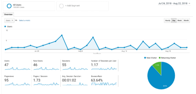
Typical Results from Freelancers and Studios


0
Visitors0
Sessions0
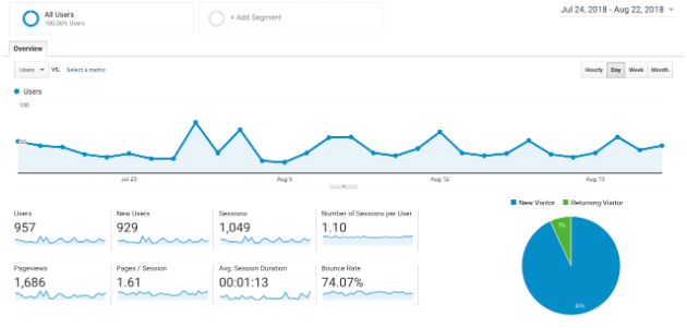
Page ViewsTypical Results from a Specialist (Me)


0
Visitors0
Sessions0
Page ViewsI like to make sure that the visitor gets exactly what they need to see at any given point. Most freelancers miss opportunities (in my humble opinion). I see all pages as an opportunity to lead the users towards action, or further nurturing, or to overcome objections.
What's really the difference?

Most website developers just buy a template and start changing things. The problem here is...
- 2000 other people also have the same template.
- It's slow and unoptimised, harming your SERP rankings
- It doesn't meet your readers' needs, losing you clients

With a solid road map, your site looks even better, AND...
- It has a unique feel that aligns with your brand
- It's optimised for speed, readability and expansion, boosting your business.
- It's designed with your customers in mind, increasing conversions.
WEBSITE & PORTAL Performance Review System
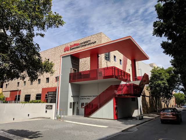
During the weekly live workshop performances, the contemporary department was experiencing a lack of engagement from the students, along with insincere feedback being gathered for the participants. I worked with the head of department to put together a portal which the students could log into every workshop and provide uncensored feedback for the students continued development. This system was groundbreaking and at the time parallel departments expressed concerns about how frank the comments might be. It proved to be a huge success and since many other departments have modelled their critique system based on the system I developed.
The website and system that Dave developed for us completely turned around the performance culture within our workshops. This system actually had such a positive impact on the students end results that the university published a chapter on its findings in a book now available through Amazon.
- DR IRENE BARTLETT
HEAD OF VOCAL PEDAGODY, GRIFFITH UNIVERSITY



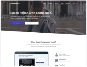
MULTISITE DIY Website Platform
Other DIY platforms such as WIX or Squarespace are great until you want to stray too far from their templates or allowed functionality. We set out to build a DIY platform entirely in WordPress which is familiar to more of the world than any other CMS - on top of that, if a user hits the 'ceiling' of what is allowed, they can simply migrate off the platform and take their site with them.


I am so impressed with the level of support and guidance that Dave gives us as developers on Stacked Site. I know I can take on projects that were previously out of my comfort zone because Dave has my back. I sing the praises of Dave and the platform everywhere I go.
- TRAYCI MCCONVILLE
FOUNDER, ONLINE WEB DESIGNS
Website & Branding Global Real Estate Training Website
WEBSITE // LMS - LEARNING MANAGEMENT SYSTEM // SALESFORCE INTEGRATION
Website Russel Street Website Design
WEBSITE // ECOMMERCE // TEMPLATE ALTERATION
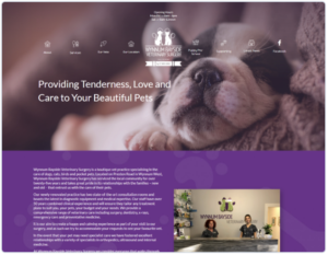
WEBSITE Wynnum Bayside Vet Website
ONE PAGE WEBSITE DEVELOPMENT
The website and system that Dave developed for us completely turned around the performance culture within our workshops. This system actually had such a positive impact on the students end results that the university published a chapter on its findings in a book now available through Amazon.
- DR IRENE BARTLETT
HEAD OF VOCAL PEDAGODY, GRIFFITH UNIVERSITY
WEBSITE New Website
I worked closely with Intrust Super and the team at BLOQ to develop the new site which recently launched. The site is a serious step up from what they had and the ease of use is evident in the hotspot analytics installed on every page. We offer unlimited revisions with every project and for this particular project, we got it right on the first iteration.
The website and system that Dave developed for us completely turned around the performance culture within our workshops. This system actually had such a positive impact on the students end results that the university published a chapter on its findings in a book now available through Amazon.
- DR IRENE BARTLETT
HEAD OF VOCAL PEDAGODY, GRIFFITH UNIVERSITY
Some of my past clients
These are just a sample of clients I have worked with. The scope of works has ranged from design work and apps, through to networked multisite solutions.


